Nesting of Row and Column
Nesting of Row and Column, in this Article i will explain on how to nest row in column or column in row by stepping through the sample program below .
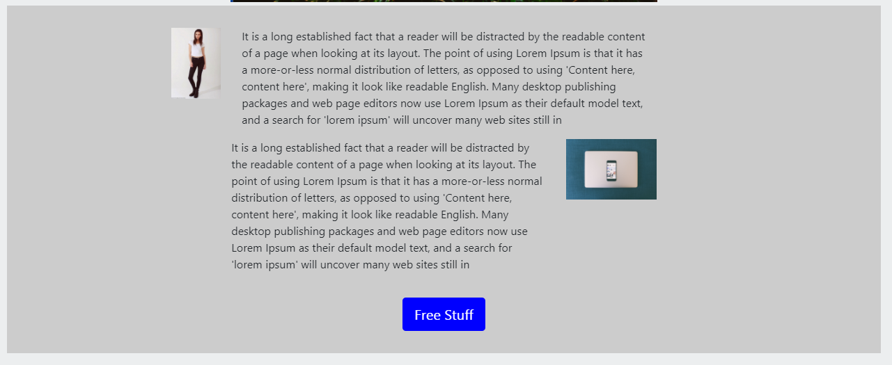
The Section that we try to create look like the below:

The HTML Code
- First I create a div section named “firstsection “
- Then i create the 1st Roll to wrap all the content
- Inside the 1st Roll 1st Column with a size of 1 during medium Screen and full width size of 12 during small screen have 2 size offset from its left.
- While inside the 1st Roll 2nd Column ,it contain 2 row
- The First Row is just the Words
- The Second Row holds the the Paragraph with words inside the column width of 9
- And the remaining column inside Second Row with a column width of 3
- Then inside the 1st Roll we, assign an Empty Column that will take the remaining balance of the column in the 1st row.
- The Final one is the column wrapper for the Buton
         <div class="firstsection">

             <div Class="row">

                 <div class="col-sm-12 col-md-1 offset-md-2">
                     <img class="img-fluid" src="assets/image5.jpg">


                 </div>


             <div class="column-sm-12 col-md-6">

                  <div class="row" >
                      <div class="col-sm-12">

                          <p>It is a long established fact that a reader will be distracted by the readable content of a page when looking at its layout. The point of using Lorem Ipsum is that it has a more-or-less normal distribution of letters, as opposed to using 'Content here, content here', making it look like readable English. Many desktop publishing packages and web page editors now use Lorem Ipsum as their default model text, and a search for 'lorem ipsum' will uncover many web sites still in </p>


                      </div>

                       <div class="row">


                           <div class="col-sm-12 col-md-9">
                            <p>It is a long established fact that a reader will be distracted by the readable content of a page when looking at its layout. The point of using Lorem Ipsum is that it has a more-or-less normal distribution of letters, as opposed to using 'Content here, content here', making it look like readable English. Many desktop publishing packages and web page editors now use Lorem Ipsum as their default model text, and a search for 'lorem ipsum' will uncover many web sites still in </p>


                           </div>


                           <div class="col-sm-12 col-md-3">

                           <img class="img-fluid" src="assets/image4.jpg">


                           </div>


                       </div>


                  </div>

             </div>
             <div class="col"></div>


         </div>

             <div class="col-sm-12">

                 <div class ="thewrap">

                     <button type="button" class="btn btn-lg anotherButton" data-toggle="modal" data-target="#freeModal">Free Stuff</button>


                 </div>


             </div>

     </div>

   </div>
Check out Bootstrap Carousel and Jumbotron here

Leave a Reply